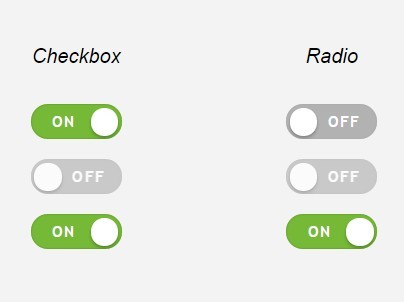
OTOH, I never know when the switch is on. Coloring it doesn't help me much, because I'm not sure it the color means current state or the one it will get after clicking. It's like with the collapse button: does ^ mean it's currently collapsed, or that clicking it will collapse some list (state vs action).
It's best to have some note next to it describing the current state ("enabled" / "disabled").
Apple is very consistent with this: the visual display always indicates the current state.
Other operating systems and third-party applications are not always consistent, even some big popular ones. 1Password used a "locked padlock" icon to both mean "it's locked" and "it's not locked (click here to lock it)", for the first 12 years. (They never fixed it, though with 1Password 7 they strangely removed the lock button entirely.)
Maybe it's because I grew up using Apple computers, but I never understood why one would make a control show the state that it isn't in.
The logic is relatively sound, you're describing what will happen when used.
Look at it from a different perspective - say you have a TV remote with two separate buttons to turn it on and off. They will be labeled after what they do and that makes total sense. Then someone says "hey, only one of these is usable at any point" and merges them into one button with magically changeable text. Should the text say what the button does or what state the TV is currently in?
A button is a bad UX example, because it is rather a switch with two indicators - now it is on, and turn it the other side/way to turn off.
A TV remote is also a bad UX example, because you can actually see that the TV is on or off by looking at the TV itself, and then use the button to perform the desired action.
Aaaargh this one gets me every time. Any interface made out of on/off toggles needs some really clear signalling to say which way is on and which is off.
Also an honourable mention goes to touchscreen widgets that look like a left/right slidey switch but are activated by a tap and not a drag.
The most confusing toggle I've seen is the "Listen for debug connections" in intellij [0,1]. It shows the current status instead of the action you would be performing. You have to click the "Hang up" icon[0] to START listening and and "Connect" icon[1] to STOP listening.
In their defense that's how most UI toggles[2] work but they are using a 'phone' metaphor and it's implemented backwards from how you would usually expect a phone call UI to work.
Interesting enough I actually agree in principle with arsenico and ken. The debug button example is a weird corner case. On pretty much every smart phone you click a green call button to make a call and click a red disconnect button to disconnect. The debug button is consistent with other toggle buttons while being the reverse of a common convention. It may have been less confusing if it was a grayed out phone when off and green when connected.
I think the problem is that the "Listen for debug connections" button doesn't look like a toggle (a slider that will move back and forth). If it looks like a toggle, then showing the current state is good because the button design is saying that it will toggle away from that current state, but if it's not a toggle, the user understands button icons as signifying what will happen.
> Also an honourable mention goes to touchscreen widgets that look like a left/right slidey switch but are activated by a tap and not a drag.
Wait, that's a bad thing? I can only imagine how pissed off I'd be when using an interface that insisted on me using my mouse to click and drag a switch to turn it "on" or "off" instead of, you know, just clicking. I don't even do the left/right swipe thing on mobile, either; way more convenient to just tap instead of drag.
Yes it's a bad thing not because of the action, but because of the representation.
It is an attempt at communicating state and action at the some time, but I think disconnecting look and behavior is a mistake. Don't use a skeuomorphic slider to represent a push button switch, especially if selling the realism of a touch interface is the goal.
I think the representation's fine (but I'm a fan of skeuomorphism...), as long as I don't have to physically drag :) Clicking on or tapping one side or the other is fine by me.
As I mentioned in my comment: even on a touchscreen, not once have I actually flicked it instead of just tapping it. It just ain't intuitive. Not on an iPhone, not on an iPad, not on an Android or Windows Phone or Palm or Blackberry or Newton or Lord knows what else.


It's best to have some note next to it describing the current state ("enabled" / "disabled").