Related: If you are interested in understanding when to use a particular type of chart and the best practice for labelling charts, the following is an excellent introduction to the topic:
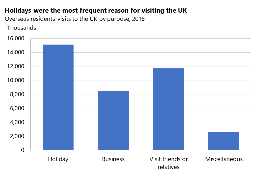
This guide is nicely written, and mostly useful for tips on labelling, but some of the advice on choosing chart types is bad. There are several examples of column charts used for categorical data, e.g. https://gss.civilservice.gov.uk/wp-content/uploads/2020/04/b...
It's OK to use column charts where each column represents a category if and only if there's some ordinal nature along the x axis, i.e. if either of these are true:
A) The categories have a natural ordering (e.g. 'age group'), OR
B) The categories are ordered by their value on the y axis (i.e. the most popular 'reason for visiting the UK' is the first column, and the least popular on the right)
In other cases, a horizontal bar chart is preferable, as it does not lead the reader to mistakenly infer some ordinal relationship between the categories.
BTW - another thing that bugs me about that chart: the y axis is labelled as 'thousands', but then the tick marks are labelled 2,000 to 16,000. It would better to use 2, 4, 6, ... for the tick marks, and label the axis as 'millions'. Even better would be to use percentages, and just mention N somewhere in the title.
Introduction to data visualisation:
https://gss.civilservice.gov.uk/policy-store/introduction-to...