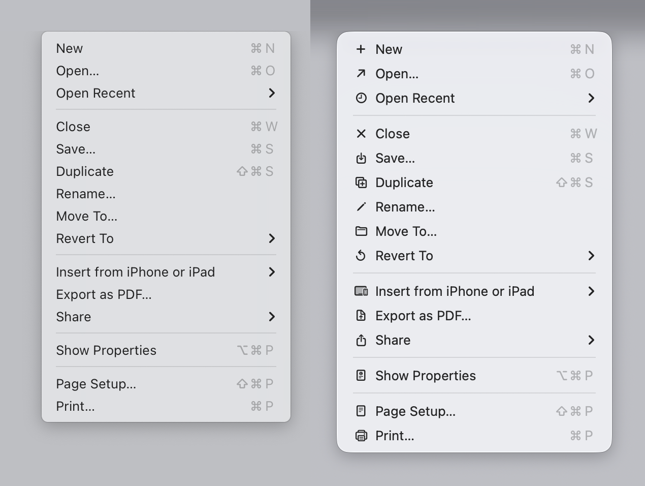
The article starts with this: > Sequoia → Tahoe It’s bad
And I look at the image... And I like it? I agree with the author that it could be better, but most of the icons (new, open recent, close, save, duplicate, print, share etc), do make it easier, faster and more pleasant for my brain to parse the menu vs no icons.
Again, I don't disagree that you could do it better, I just disagree with the premise that the 1992 manual is "the authority". Display density has increased dramatically; people use their computers more and have been accustomed to those interfaces, which makes the relationship of the people with the interfaces different. Quoting a 1992 guideline on interfaces in 2026 feels like quoting the greeks on philosophy while ignoring our understandings of the world since then.
Humans are definitely not the same as in 1992 when it comes to their everyday knowledge of computer interactions.
And even if human cognition itself were unchanged, our understanding of HCI has evolved significantly since then, well beyond what merely “feels right.”
Most UX researchers today can back up their claims with empirical data.
The article goes on at great length about consistency, yet then insists that text transformations require special treatment, with the HIG example looking outright unreadable.
Menu text should remain stable and not mirror or preview what’s happening to the selected text IMHO.
Also, some redundancy is not necessarily a bad thing in UI design, and not all users, for various reasons, can read with a vocabulary that covers the full breadth of what a system provides.
Most UX researchers today can back up their claims with empirical data.
HCI work in 1992 was very heavily based on user research, famously so at Apple. They definitely had the data.
I find myself questioning that today (like, have these horrible Tahoe icons really been tested properly?) although maybe unfairly, as I'm not an HCI expert. It does feel like there are more bad UIs around today, but that doesn't necessarily mean techniques have regressed. Computers just do a hell of a lot more stuff these days, so maybe it's just impossible to avoid additional complexity.
One thing that has definitely changed is the use of automated A/B testing -- is that the "empirical data" you're thinking of? I do wonder if that mostly provides short-term gains while gradually messing up the overall coherency of the UI.
Also, micro-optimizing via A/B testing can lead to frequent UI churn, which is something that I and many others find very annoying and confusing.
Tognazzini and Norman already criticized Appple about this a decade ago, while the have many good points, I cannot shake the feeling that they simply feel like the were used to just brand Apple as user friendly in the 90s and that Apple never actually adopted their principles and just used it as it fit the company's marketing.
Hmmm, I don't quite see where that supports "Apple didn't do empirical validation"? Is it just that it doesn't mention empirical validation at all, instead focusing on designer-imposed UI consistency?
ISTR hearing a lot about how the Mac team did user research back in the 1980s, though I don't have a citation handy. Specific aspects like the one-button mouse and the menu bar at the top of the screen were derived by watching users try out different variations.
I take that to be "empirical validation", but maybe you have a different / stricter meaning in mind?
Admittedly the Apple designers tried to extract general principles from the user studies (like "UI elements should look and behave consistently across different contexts") and then imposed those as top-down design rules. But it's hard to see how you could realistically test those principles. What's the optimal level of consistency vs inconsistency across an entire OS? And is anyone actually testing that sort of thing today?
I cannot shake the feeling that they simply feel like the were used to just brand Apple as user friendly in the 90s and that Apple never actually adopted their principles and just used it as it fit the company's marketing.
I personally think Apple did follow their own guidelines pretty closely in the 90s, but in the OS X era they've been gradually eroded. iOS 7 in particular was probably a big inflexion point -- I think that's when many formerly-crucial principles like borders around buttons were dropped.
The person I replied to said, "that interface designers or even the average computer user understands more than in 1992 is highly implausible on its face"
Think of computer users at the ages of 10, 20, 30, 40, 50, 60, 70, and 80 in 1992. For each group, estimate their computer knowledge when they sat down at a computer in 1992.
Now do the same exercise for the year 2026.
How is it highly implausible on its face that the average computer user in 2026 understands less than the average computer user in 1992?
> The person I replied to said, "that interface designers or even the average computer user understands more than in 1992 is highly implausible on its face"
Yes, I agree with this person.
>How is it highly implausible on its face that the average computer user in 2026 understands less than the average computer user in 1992?
I don't think it is. Particularly with the average user, the bar of understanding is lower now.
> Particularly with the average user, the bar of understanding is lower now.
Can you explain how this is true given that everyone using a computer today has had a lifetime of computer use whereas in 1992 many people were encountering computers for the first time?
1. Computer users were generally well-educated, unlike today.
2. UX designers didn’t inherit any mess and could operate from first principles.
3. The “experience” of modern users—phones, tablets, and software that does everything for you—doesn’t translate the way you think. And it explains why Gen Z seems to have regressed in terms of tech knowledge.
> Can you explain how this is true given that everyone using a computer today has had a lifetime of computer use whereas in 1992 many people were encountering computers for the first time?
The userbase has been watered down with a larger proportion of individuals who are not highly technical.
most of your points are refuted in the article. but I'll pick this one : "Display density has increased dramatically" Yes, it has, and Tahoe does not take advantage of this, infact the icons are smaller, and harder to read, using fewer pixels than windows icons of 25 years ago.
Yet, we can't refute that my subjective opinion evaluation of the opening image looks better (for me) , reads better (for me) and is easier (for me) to parse. Either I don't fit the general guidelines, or the general guidelines need a revision, that's my point overall.
But answer me this. You say "but most [but not all? - interesting] of the icons do make it easier, faster and more pleasant for my brain to parse the menu vs no icons."
How does a list of icons that are used inconsistently, duplicated, used in other places, sometimes used and sometimes not used, not to mention illegible, positioned inconsistently, go directly against the broad (reasoned) rules of the Apple HIG, help 'make it easier' as you say?
This is literally what half the article is explaining and you are just saying - no it's easier to not be able to tell an icon apart, and it's easier to have the icons sometimes be the same or move locations, be so small as to be illegible.
How many did you get when the menu text was removed ? I just don't believe it makes it easier. But who am I to argue against someones 'subjective opinion evaluation' I'm just a guy on the internet.
ps I assume by the opening image, you mean the first screenshot supplied by the author of the article - the Sequoia to Tahoe menu comparison, which he brilliantly posted below a shot of the HIG which literally is explaining the exact same thing and why not to do it the Tahoe way. That in it self is confusing.
It makes no sense why Apple chose to do that with Tahoe?
I'll add a general comment - one of the reasons I use Apple systems was they had the UI stuff nailed down. Stuff was consistent. It looked and behaved in proper ways. It felt like a properly designed, holistic approach to UI design. Lately it's just a mess. This article touch the surface of the issues. My current beef is this stupid 'class of window' that appears now and again which is half-way between a dialog and a window. Best place to see it is immediately after a screenshot - click the thumb that appears. This window type doesn't behave like any other window. Z-order, closing, focus, actions that occur when you click certain things, are all different and inconsistent. But it does look a little like IOS though.
> of the reasons I use Apple systems was they had the UI stuff nailed down (...) Lately it's just a mess
I have never daily driven an Apple device, so I can't comment on this; but from what I seen I do agree that Apple UI has not been as consistent lately.
> ps I assume by the opening image, you mean the first screenshot supplied by the author of the article
> How does a list of icons that are used inconsistently, duplicated, used in other places, sometimes used and sometimes not used, not to mention illegible, positioned inconsistently, go directly against the broad (reasoned) rules of the Apple HIG, help 'make it easier' as you say?
Sure! First of all, I'm only commenting on the FIRST image of the blog. There are no duplicated images in it. The icons appear consistently used in that image (maybe export to PDF looks a bit off, but this is a pattern that I have seen repeated on other apps, so I'm used to it). I'm not sure how the icons would look on the actual display, but they look alright on my 4K display as shown on the blog. I also can't comment on they being used "inconsistently" across other parts because I don't use Apple devices.
I'm making a very narrow claim: On the first image, if I compare the menu on the left, with the menu on the right, I prefer the menu on the right. I have tried to "find X" on a menu on the left and then repeat a similar exercise on the right; I am faster on the right and I am more confident on the right. My brain seems to be using the icons as a "fast lookup" and the text to verify the action.
Now, does this translate to all other menus? No! The "File" example he shows is super confusing.
Also, it's possible I would prefer the less cluttered version with less icons. But for me (all icons) > (no icons) on that specific example.
I have not put enough mental energy to agree with the author on all of his individual suggestions across the article, but they look overall fine on the individual examples he provides. I'm just find the first example... not particularly compelling.
> Well - that's just your --- opinion, man
Well... Yes. But unless we objectively measure how I use the computer, that's the best we have got to evaluate my preference.
All my classes on human-computer interaction and design has always been about "listen to your users".
The article starts with this: > Sequoia → Tahoe It’s bad
And I look at the image... And I like it? I agree with the author that it could be better, but most of the icons (new, open recent, close, save, duplicate, print, share etc), do make it easier, faster and more pleasant for my brain to parse the menu vs no icons.
Again, I don't disagree that you could do it better, I just disagree with the premise that the 1992 manual is "the authority". Display density has increased dramatically; people use their computers more and have been accustomed to those interfaces, which makes the relationship of the people with the interfaces different. Quoting a 1992 guideline on interfaces in 2026 feels like quoting the greeks on philosophy while ignoring our understandings of the world since then.